All your memories in one place, a modern journal that autofills your missed days.

Souvenir is a modern daily journal that leverages image and data suggestions to help autofill the days that are missed. It encourages you to keep track of your days through an approachable and aesthetic interface. Your memories and thoughts are captured in one place and not scattered across platforms – scroll through, search, and relive your favorite days.
Role
Lead Visual & Interaction Designer (See details)
Skills
UX Strategy & Research
UX Design
Visual Design
User testing
Wireframing
Motion/Prototyping
Goals
Make documenting your every day as easy as possible, provide the singular place for all your memories while promoting the advantages of journaling.
Approach
Following the entire strategic design process starting with researching and exploring the challenge, I defined and developed the entire product with features based on key user needs and pain points.

Problem
In today’s age, we constantly document our lives through various platforms and camera rolls. It is easier to rely on our camera roll and ‘video stories’ to remind ourselves of what we did that day. The old-fashioned diary becomes less common because of the additional time and hassle to write. The memories of the days are then limited to what we decide to capture and lack our thoughts and feelings from that day.
With my own assumptions on journal keeping backed with research and analysis, I set out to answer this design challenge: How might we simplify and re-imagine the diary that encourages young adults to intentionally document their lives?
Solution
We wanted to make documenting your every day as easy as possible, providing the singular place for all your memories while promoting the advantages of journaling.
Souvenir is created for everyone; whether you want to write up a story or keep it a one-liner. Through intuitive interface and data suggestions, anyone can easily add images and write about their adventures. To encourage young adults to keep a journal, the app auto-fills an image and title for every day that is missed. Then you’re able to easily go back to edit the image, title, or add more details! After the entries, you can favorite days you don’t want to forget and easily search for your memories without endless scrolling.
Visual identity and branding
As a photo-heavy app, we wanted the images of daily life to be the main part of the brand because the meaning and use of this app morphs slightly to its users. The visual of ripped photos subtly nods to how we piece together memories in our minds where our days are made up of fragments of what we remember.
The brand colors are inspired and named after nature, color-picked through photos: white clouds, pink sands, daydream blue, coral pink, and picnic greens. The tiddle of the i is removed from the wordmark, representing the idea of a ‘souvenir’.
User Research and Personas
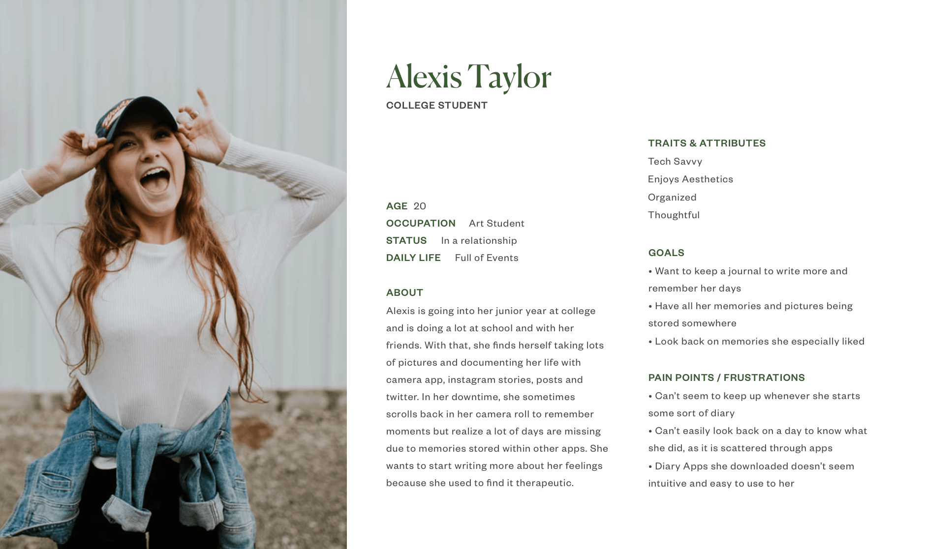
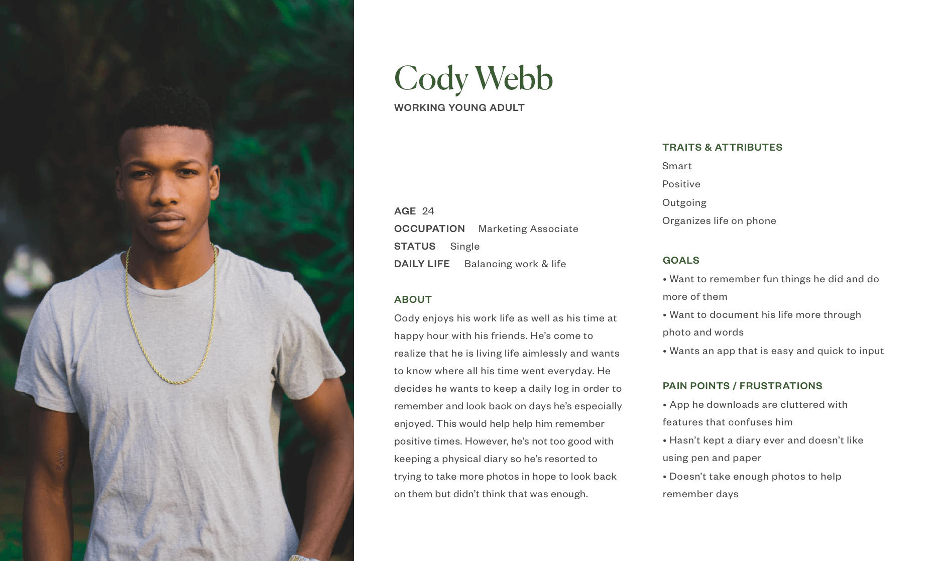
A large part of this project was researching potential users to understand their current behaviors and key pain points. Through interviews and surveys; I found that everyone in the study scrolls back through their camera roll to remember what had happened on a specific day, 63% want a journal for memories and reflecting on feelings, whereas 15% want it for therapeutic and health reasons; and people like the idea of an easy way to look back at past diary entries. Most of the people who don’t journal think it is inconvenient and doesn’t have time for it, which is what auto-fill could solve for.
From the data, I identified and created 2 clear personas to better understand the users I’m designing for. This guides me in designing for Souvenir’s key features.

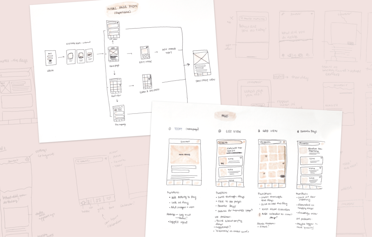
Wireframes informed by use cases
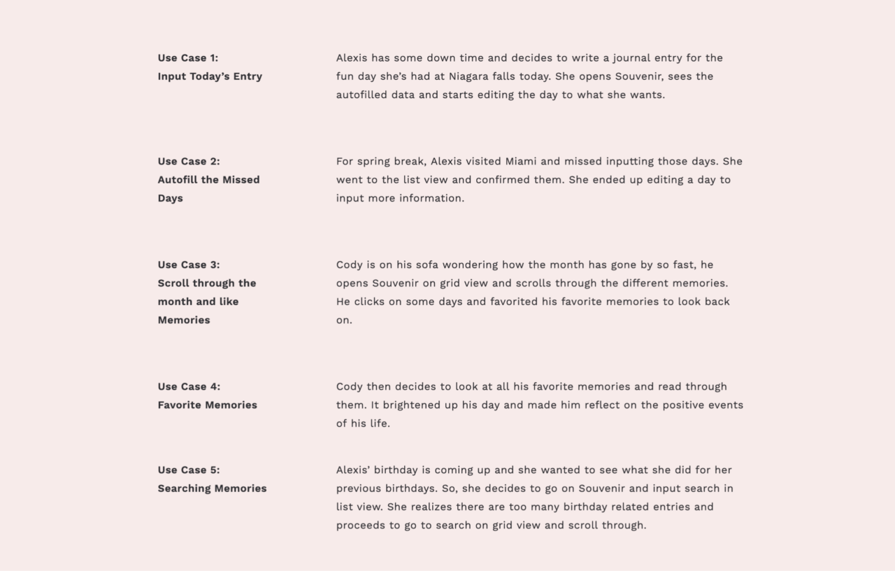
I mapped out 6 key use flows based on the persona’s core needs and pain points. These use cases translate to specific functionalities of this product: input today’s entry, autofill missed days, scroll through and favorite memories, search memories, and export the journal.

UX Challenges
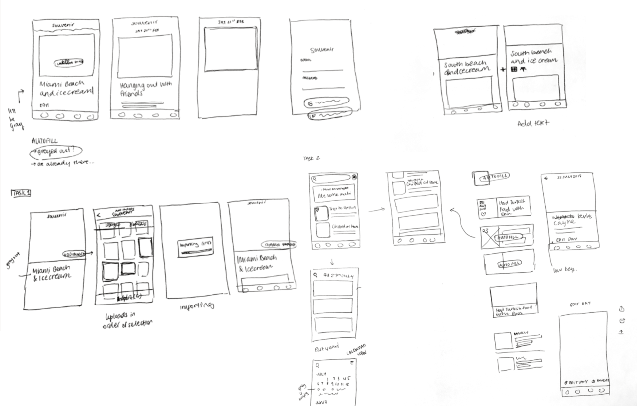
With the journal being constantly editable, I had to differentiate the use case of looking back on memories and editing the entries. Additionally, I had to think of UX patterns for how the autofill feature work, where suggested data needs to be differentiated visually from manually entered content.

Process sketches, specific use cases and journeys, and initial wireframe user testing
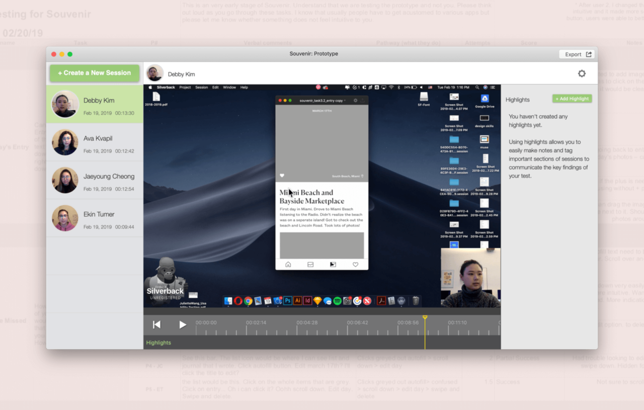
Usability testing
I prototyped the wireframes and conducted usability tests on the 6 main user goals. This allowed me to test assumptions and how users interact with the functionalities which was overall successful. I found insights on secondary, hidden functions when it took users multiple attempts to achieve the task. Additionally, it made me realize there tend to be several ways to achieve a goal whether it is different gestures or ways of navigating.

